Friday, 27 November 2015

Album Cover Shoot

We got Joe to come with us to the Odeon cinema at Guildford and took hundreds of pictures of him for our album font/back/inside right/inside left covers. We ended up picking these two pictures and working on them.
Front

After taking the all pictures we gave them to Lucas, a group member, who edited them and produced the album cover.
Back 

For the edit of the pictures we agreed that we wanted the font of the writing to be relatively sloppy, almost as if it were a child who wrote it. We wanted to create the connotation that the artist doesn't care what handrwiting his album cover has, therefore, intensifying the fact that all he cares about is this girl that he loves and whom he can't get, which is part of the lyrical context of the song in our music video. Later, we wanted him to be the main focus of the pictures. In order to achieve this we blurred out the outsides of the picture leaving him on focus and then went on to enhancing the linear and clear qualities of what wans't blurred out already, thus making him look "sharper" in the picures.


Thursday, 19 November 2015

Suggestion for a New Element and Group Decision

We were advised by the media staff to add a new element to our music video, just as a plan B. We were told that we were limited with how much much we'll be able to plug in, maybe defeating our main concept of flooding the room with red lights. It's nearly impossible to have extentions for that many plugs.

 The suggested idea was to use various red light sticks that will be placed in a way that will make it look like a jail. And we could use this element to have one actor on one side and one actor on the other side. Furthermore the actors could even move them around as the video progresses.

Our group got together after being fedback and decided we did indeed need to add a new element to our music video just in case if it's too little. We came to a conclusion that we should not use the red light bars and instead add a shot of Joe (our main actor) lip syncing in a simple black background and him red lit. Furthermore, we will add a drawing element to every frame of the shot, adding this style of editing to our music video. In addition this simple computer hand drawing style will tie in with our idea of the font of the album cover. This is the font style we have in mind for our album artwork.
This is the style of editing that was described, except, it would be added on top of the recorded video frames.

Monday, 16 November 2015

Call List

This call list was made in order for our group members, as well as the actors, to contact each other when needed. Just in case that something unpredictable happens and we need to contact a member as soon as possible

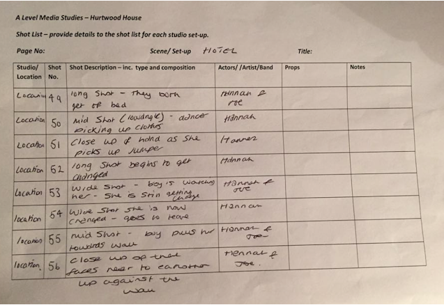
Shot List

We made a shot list that would describe every single shot, in detail, we intend to use in our music video.


Group Feedback on all Members' Album Artworks

My group and I got together in order to feedback each others' album artwork and provide feedback on what worked and what didn't work. In addition this also shows our process of coming up to the final conclusion as to which album artworkis best and which one we should use for the artist. However, we are still likely to manipulate our the decided product in this video in order to improve it and better it in terms of the conventions of the Genre, alternative RnB.


 Feedback for my album artwork:


I got some positive feedback as well as some negative feedback on my album artwork idea. However, it still ended up being discarded because it wouldn't work. The reason why it wouldn't work is because of a few reasons, one because it would give too much away about the video. Eventhough it would be possible idea, maybe I would need to be more subliminal and not too obvious about the connections my album artwork had with the music video. A good example of an idea that links in the album artwork with a music video is Green Day's American Idiot song and album, where they show the album artwork in the music videos a couple of times. My group however thought otherwise and decided that we would be very limited to tweaking the idea afterwards because it would still need to be something part of the music video.

Thursday, 12 November 2015

My Group Members' Ideas for the Album Artwork

Excluding mine, these are the other ideas that the rest of the group had for the algum covers, with annotations to explain them in further detail...


My Design Idea for the Album

I drew what I imagined would be ideal for the album artwork for our music video. I imagined getting one bit from the actual music video idea and put it on paper. The scene I chose to draw was the part right before the dancer leaves the room leaving the performer behind in the bed. The reason why both characters are shadowed is because the source of light is the rectangular object behind the bed attached to the wall and not from the camera's view, giving them a red outline. The setting of the artwork is located in the hotel room, of a shot centering the bed in the frame.


I wrote down some annotations on the bottom left side of the paper saying:
  • It is important to consider the red lights hitting them from the opposite side of the camera, giving the red outlines, and leaving the side facing the camera shadowed. 
  • The mood of the design is slightly depressive, which is the reason why the room is going to be generally dark and dim lit from behind. In addition the depressive mood of the artowork also directly relates to the lyrical context of the song which is about love and depression.
  • The main colours in the artwork are black (from the shadows), and red (from the only light source).
  • The link with the music video idea is the moment where the woman walks out of the room.
  • I believe the mood of the track "Without U" is clearly portrayed, therefore going with  the conventions of the genre. Thus attracting our target audience.