Wednesday, 27 January 2016

1. In what way does your media product use, develop or challenge forms and conventions of real media products? (Comparing Digipacks)

This is my Digipack (Fredo Fanheit - Self Entitled)


This is Adrian Marcel's Digipack Cover (Adrian Marcel - Take Your Time)

This is Miguel's Digipack Cover(Miguel - Wildheart)

When comparing all these with my Digipack's front cover We can see clearly that the only one that is synthetic is Miguel's. Therefore we can say that my digipack, despite the front cover being quite heavily edited and manipulated we can still see that my artist, like Adrian Marcel, still maintains an organic feel. However what really enforces this is the fact that there is some 'hard-to-read' writing on both my front and back cover of the artwork of the album. While the other two have perfect writing that is either very easy to comprehend (Adrian Marcel) or no writing at all enforcing the fact that the centre of attention of that album artwork is the artist himself and nothing else (Miguel). Therefore, due to this, we can also say that my artist, regarding the front cover, according to Negus' organic and synthetic ideologies, my artist is more organic then synthetic, therefore, Fredo Farenheit goes against ths symbolic convention of R&B and alternative R&B artists' images.

When discussing location, Fredo Farenheit is the only Artist of the three of the same genre that is in a location where the mass audience can relate to. Fredo is in a garage car park, which is easily recognizable to an audience. While Adrian Marcel is in what looks like to be a field, he is still portraying a synthetic artist feel. This is becuase for one, not many people relate to a field like that, since the majority of the target audience is from urbanized areas. Therefore, Adrian Marcel is able to trick his target audience that by being in a field he is different, trying to portray himself as organic. However, the picture looks extremely staged and plays a lot with the shadows and lights, making him actually a synthetic artist. Miguel on the other hand is in a completely different end of the spectrum. He is in an unrecognizable location, he seems to be located in the clouds, alond with another girl who is undressed. This makes him extremely synthetic with one goal on his mind, to show off and impress. Which is usually a convention that many or at least most alternative R&B and R&B artists follow. Thus, Fredo Farenheit is actually subverting to this 'perfect looking' stereotype that artists of the genre have.


Tuesday, 26 January 2016

1. In what way does your media product use, develop or challenge forms and conventions of real media products? (Comparing Websites)

In my previous post I explained what codes and conventions were and how they are broken down into symbolic and technological codes. In this post I will be making the same kind of comparison regarding websites as opposed to music videos. So does our website adhere or subvert to the codes and conventions of other alternative R&B artists?


First and foremost, does our homepage go with or against the 'stereotypes' of other R&B and alternative R&B artists? The layout of our website is quite simplistic. just like the homepage of Adrian Marcel. However, his' is still a bit more detailed. In addition, his homepage  includes the color white, but despite that, both our websites  maintained a similar and quite simplistic color scheme of two or three colours, in my case black and red. Black seems to be a colour that is very persistent when searching for websites of this genre. I found another alternative R&B artist's website that followed the same color scheme in order to support the fact that our website colors go with the conventions of the genre. We can see the similarities in color between Adrian Marcel's website, Miguel's website, and our own despite lacking the color white.


In regards to layout there are quite a few similarities between all the sites, however, also a few differences. First of all, while most websites work in a tab manner, where you have to click the tabs that direct you to a different page of the website,  my website works in a scrolling manner. We essentially put all of our content on one page and all of it can be found while simply scrolling down the page. Similarly like how Adrian Marcel did his, but without the sections on top that you can click to be directed to that part of the page. Personally, despite this technical convention going against of other R&B artists, personally I believe that it was more effective for the star image of Fredo Farenheit because we wanted his to be mainly an organic artist, therefore, by not making such a professional looking website it makes it seem as if he is not so much about his products and looks, and as instead, he is all about his music and his talent, and does not mind having a website that is not fully up to industry standarts. In addition I also personally believe that by having only a scrolling motion to our website it makes it more user friendly as there is only one motion in which the audience has to do in order to browse it. Resulting in a more user friendly website as well. In addition, the fact that my artist is organic and not synthetic goes against some R&B symbolic conventions. As can be seen above, in the homepage of each artist there is a picture of him. Quite a photoshopped 'perfect' looking picture. Whereas our aritst has a more natural look to him, this again re-enforces the fact that he is organic and does not mind about how his looks are shown to the audience.


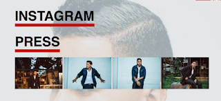
 My next point which once again re-enforces the fact that my artist is organic is the fact that there is no video or photos section of him on my website, this once again states that he is a musician who is interested in sharing his music to the world as opposed to pictures. We can see that both Adrian Marcel and Miguel are quite synthetic, due to the fact that they are considered musicians yet still have other tabs in their websites like videos/photos/media or instagram press. While in my website there is not a page intirely for pictures, the pictures are shown naturally throughout the one page.


However, Fredo Farenheit is not fully organic as the website I made for him also shows him being synthetic due to the fact that we have a merchandise section. Not only that, but when the digipack front cover is featured there is clear evidence that my artist also has a touch of synthetisis on him. Overall this makes our atist go agains the symbolic conventions of synthetic R&B artists however, a slight part of Fredo still goes with those synthetic conventions. As a result, I personally believe that this creates a nice balance of how my artist is portrayed to the public as well as still making the audience believe he is all about his music, when in reality, a small part of him is still organic.

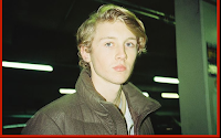
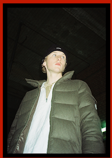
Clothing-wise, I firmly believe I made Fredo go against the conventions of other R&B artists. Since as I said before, we want the audience to think that he is not that special in his looks because he doesn't care about that. So we can see that is is simply using a plain white shirt underneath a standard coat on top. This makes the audience connect with our artist since they believe he is not any better then them. Due to the fact that he is wearing simple clothes that you would see in everyday life.


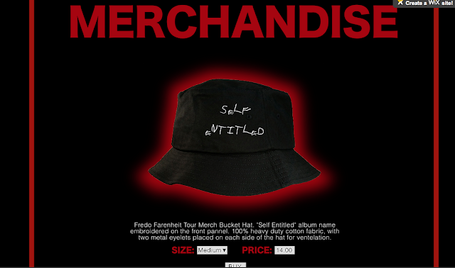
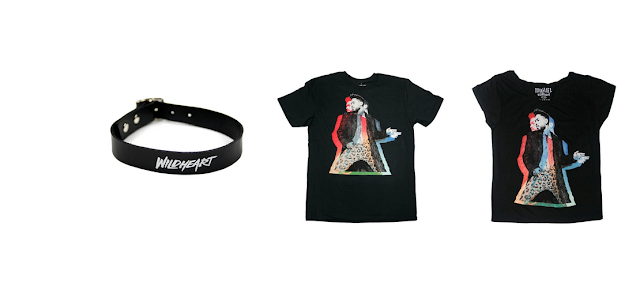
After speaking about clothes, this brings me to merchandise, another way in which my aritst goes with R&B artist. R&B artists are known for wanting fame, and wanting people to have this image of them in their heads in which they are the best and the most successful. Where selling clothes with images of the artist on them enforces this factor, I believe that by seeling Fredo's clothes with quite simplistic drawings on them was going against this convention. This is due to the fact that Fredo does not care about attention. Despite selling clothes, he does not sell them to spread his image, or to be full of himself. he sells them simply for extra profit.

Monday, 25 January 2016

1. In what way does your media product use, develop or challenge forms and conventions of real media products? (Comparing Music Video)

Codes and conventions are key to obtain a full understanding of how the media industry works. Codes and conventions are essentially the ways in which a specific genre is portrayed most of the times. Basically meaning that it is what we as people associate specific themes or genres with. For example, associating a horror film with knifes and blood, or associating the rock genre with guitars, punk hair and leather jackets. My group's music video was from a song by an unrecognized artist who sings alternative R&B. It is debatable that being an alternative genre of music codes and conventions may not be greatly associated, since the genre itself is already differs from regular R&B music. However, many of the times the alternative R&B media products go with the regular conventions conventions of R&B music.


Codes and conventions may be separated into two different categories, being symbolic conventions and technical conventions. Symbolic meaning its things like objects we associate the genre with (i.e. knifes in horror films) whilst technical meaning its things like sound, shot types and other technological techniques.(i.e. the fast paced editing in action films) I have picked  two different music videos of the alternative R&B genre in order to compare and contrast my own to them. One is Adrian Marcel - 2AM , and one being PARTYNEXTDOOR - Break From Toronto.

 Regarding lighting, it is debatable whether our music video adheres or subverts to the general technical code of R&B music. Despite most videos of the genre having a use of a different colored lighting, it is usually only used for a couple of seconds. We have indeed used a different colored lighting, however we kept it going for the entire music video. Additionally, we have used the colored lighting technique in a very strong visual manner, completely flooding the room with red lighting. Whereas they were a bit more subtle when it came to that aspect. As it can be seen, Adrian Marcel's music video has used blue/purple-ish lighting in a subtle way. And the use of red and blue lighting in PARTYNEXTDOOR's video. And the strong use of red lighting in ours. Thus, it is debatable whether we have adhered or subverted to the use of colored light.

(My Video)

(Adrian Marcel)

(PARTYNEXTDOOR)

One way in which we were sort of forced into challenging the symbolic codes and conventions of the genre was through not having any nice/wealthy cars. The reason why I say we were 'forced' into cahllenging this convention is because we are doing a school educational coursework, not a professional product. This can be seen in the two examples below.


Despite challenging this symbolic convention, we have also went with one quite stereotypical symbolic code that can be seen, almost certainly, in any R&B and alternative R&B music videos. This being the use of attractive women, usually to show that the main artist is "cool" and is successful with the opposite gender which not only attracts men but also makes them jealous of the performer's life.


One technical code that is similar within all three products is the camera work. More specifically the use of specific shots that are similar when the actor is singing. As it can be seen in these next pictures all the rappers are centralized in a mid shot while all performing the same action, which is singing and doing hand motions.

 Overall, despite having some differences, we can still say that our video leans more towards adhering to the generic codes and conventions of the genre. However, due to the amount of differences, it can be argued otherwise, but personally, I believe it adheres more than it subverts.

Tuesday, 19 January 2016

Feedback of our Current Website

 Here is what our current website looks like:
So we showed our current website to Mike, our media teacher and got some positive and negative feedback from it. Mike said that the design element and the red/black colour theme. However we were still missing quite a few bits of criteria that are essential to a better website. One being that we needed a link to social media of the artist. Mike also said it would look even more visual if we added a picture on the homepage as opposed to just a text. Also he said that we should order our website better, as in we needed to see the advertisement of the music as the first thing when starting to scroll down the page. Additionally, we needed to add some more criteria that were 'Connect with Fans',  'Merchandise' and 'Upcoming Tours'.

Monday, 18 January 2016

Learning Wix

I have never used Wix before in my life. In fact, I have never made any website. So I decided it is time to get familiar with it and make a post on what I learned after having a go at it. So firstly, I made an account using my email and then I clicked 'create a website'. After that I was given a list of themes of which I could pick from to start my website from.

 I picked the theme 'EPK - Musicians' and was given the following default layout.


Essentially the website creator has a few tabs on the left hand side that are used to add items to the website. The top one is to change the background picture. I tried it out and picked a random picture just for the purpose of learning how to use it. I ended up with this: 
Next I wanted to  see what the second little tab does. Essentially, it lets you pick anything you would like to add to your website. From images, to music, to videos, and plenty of other options. I make music myself, therefore I decided to try and add some music embeded from my soundcloud to the webpage for the purpose of just learning how to use wix efficiently. To do this I went to my soundcloud and copied the embed code. 
I then went to the music tab on wix and picked the soundcloud window option. I dragged the soundcloud player to the homepage where I wanted it to be. I then went to 'settings' and pasted the embed code of my song. 

After that I wanted to learn how to manipulate the header. In order to do that I scrolled down to this section:


And decided to change the picture, the title, the news tab, and the details. I did this by double clicking on each section and then clicking on 'change text' or 'change picture'. I ended up with this.


What I learned from this experiment is literally how simplistic and convenient Wix made it for a free user to create their own website. This is a great example of how the proliferation of hardware and content is making technologies become easier, cheaper, and better.  Now that I have a decent understanding of how Wix works I can move on to making the website for our artist.

Saturday, 12 December 2015

What Should be Included on a Website?

Essentially there are a total of 12 different things that are, or at least should be included on a website.
  •  A website must include an attractive, intriguing headline that will please the audience the moment they access the homepage.
  • A website must also include a sub-headline that supports its headline. It should include a brief description of what is offered on the website.
  • Thirdly, a website must include a series of tabs that redirect you to a different part of the website
  1. For one, a website must include an attractive, intriguing headline that will please the audience the moment they access the homepage. 
  2. Secondly, a sub-headline. What good is an amazing headline and a bad sub-headline. The sub headline should include a brief description of what is offered on the website. 
  3. In addition, an adequate website must also include primary calls-to-action. Essentially menaing that the website must have a few (CTA's) in the main page that will direct people to places further down the website page. This is crucial due to the fact that the main purpose of a website is to intrigue people and make them dig further down into it. 
  4. A supporting image is also critical in the making of a website. This is because the majority of people accessing it are most likely to be visual people, as most of the population in the world is. Therefore having an image or even a video that intrigues the visitor will likely keep their attention for longer. The use of the image should be quite intelligent, as it needs to capture the emotion and cause a certain feeling to the visitor, and simultaneously provide a visual description of what the website is offering. 
  5. It's no good only telling the buyer what the website has to offer, it needs more convincing. Therefore it is also very important to let the buyer know that the content or product is worth their investment. That is the reason why explaining why it all matters is important. This needs to be done in a simple way, so keeping it short and keeping it in the language of the buyer is important.
  6. Social proof is a powerful tool that indicates trustworthiness to an audience. Because by having positive comments and feedback to the website will convince the buyer that the content is indeed worth it. 
  7. Navigation must be easy and accessible, therefore it is important to keep a clear and visual path in order to redirect the clicker into the website and making it easy for them to find exactly what they are looking for. It is often a good idea to include a search box for those reasons.
  8. A good content offer using either a whitepapaer, ebook or guide only benefits the website because it generates more leads from the homepage.
  9. In addition to the calls-to-action, the website must also include some good secondary calls-to-action. By having decent secondary CTA's, the website is able to offer additional content is case the visitor isn't interested in the primary ones. It is also important to give the visitors something to click when they scroll down the website. 
  10. Give the audience some of the key features, so that they can understand more precisely what the website has to offer, and make them not waste their time on somehwere they wouldn't like to be. Once again, it is important to keep the content easy and simple to read. 
  11. In the case that the visitors to the website are not ready ti buy, a website needs to offer a link to a resource center where they can learn more. This makes the website more trutworthy once again, and establishes that the website is for real about their products and also makes them look a bit more professional. 
  12. In order to build a better first impression of the website it must also have a success indicator somehwere in it. Either including statistics of visitors or purchases from the website, or including things like awards to prove success.

Feedback from the AS students

We had a class where we joined with the AS students who have media at the same time as us and showed them our rough cut and asked them to provide us with feedback in order for us to improve our edit. I have filmed the feedback that we got from them.


In order to obtain individual answers we distributed sheets to the AS students with the questions in order for us to obtain individual feedback from each one of them afterwards.